Melissa Szwan is
a graphic designer.

Chicago Undersea Explorers Society
PERSONAL WORK; BRANDING IDENTITY DESIGN, COLLATERAL
Background
Founded in 2020, the Chicago Undersea Explorers Society (CUES) is a registered 501(c)(3) with the mission to “foster curiosity, camaraderie, and diversity through underwater education and exploration”. CUES works to provide low-cost and sponsored dive-training, prioritizing those who have historically been excluded from the sport.

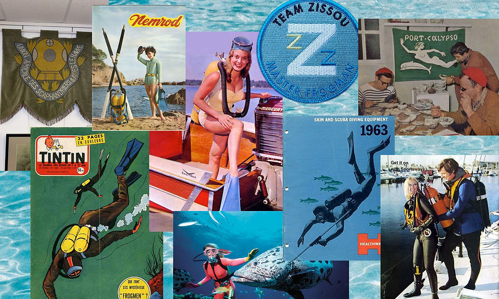
MOOD BOARD
Background
Aesthetics in the SCUBA world are not the most sophisticated — we wanted to design a brand that felt professional, accessible, and rooted in the history of dive-clubs, while avoiding the stereotypical imagery you see in dive organization branding (diver down flags, silhouettes of divers, and in the case of MWUE, cows).
We also wanted it to be friendly — our mission is to invite excluded groups into our underwater world, we didn't want our branding to feel too lofty or exclusive, either.


TYPEFACE: BRANDON & FUTURA BOLD
The solution
We looked to vintage dive advertisements and photography, as well as club logos for inspiration, and relied on the dominant colors of the underwater world for the palette — as you dive deeper underwater, you lose the shortest wavelengths of light, making blue and yellow stand out much more than reds.


GEAR TAG


