Melissa Szwan is
a graphic designer.

CommunityHealth Branding
BRANDING IDENTITY DESIGN, COLLATERAL, ILLUSTRATION, COPYWRITING
Background
CommunityHealth, located in Chicago, is the largest free clinic in the nation, serving 8,500 uninsured adults in Chicago each year with the support of over 1000 volunteers.
The problem
CommunityHealth's original logo was not working for them — it was difficult to use due to its complexity, lacked the credibility to stand out alongside benchmark institutions, and importantly, was misleading. The clinic only serves adults, so the inclusion of child-like figures in the old logo was problematic.
The solution
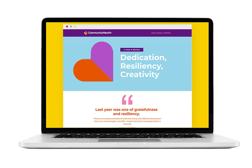
The new logo is clean and simple, built on the combination of "community" (a heart) and "health" (a medical cross). Bold, simple typography balances the icon, and is easy to read at a variety of sizes.
The brand is designed to speak to everyone. It utilizes clear, easy-to-read typography, a warm and inviting color palette and a suite of icons developed to aid in literacy at all levels and across languages.


TYPEFACE: NEXA

The solution
The new logo is friendly, clear, and incorporates a medical cross — the international symbol for aid. Colors are bright and friendly, while the chosen typeface is easy to read (and meets the Smithsonian standards for accessbility).
Icons
CommunityHealth patients speak 11 languages and have varying levels of literacy. One of the key brand elements is a suite of icons to help communicate key information more clearly.


Window mural
CommunityHealth has 9 exterior windows that face Chicago Avenue. I designed a series of one-way perforated window clings to brighten up the clinic's exterior. The large intestine is particularly beloved by staff members!